
Information Architecture Redesign
Revamping the settings menu to align with users' mental models
As KAYAK for Business grew, the settings experience became cluttered and hard to navigate. I led a full information architecture redesign using UX research and tree testing to uncover pain points.
Based on those insights, I restructured the menu, simplified access, and tested a new prototype, making key features easier to find and the experience more intuitive.

Role
UX Researcher
Time
2 months
MY OBJECTIVE
Restructure the information architecture for a more intuitive, user-friendly experience, making content easier to find and navigate.
The Process
To avoid product bias, I recruited external users through UserTesting.com, running remote, unmoderated interviews to get fast, honest feedback.
From there, I moved through an iterative process to reshape the information architecture:
-
I crafted a screener to make sure I was hearing from the right users, those most likely to interact with the settings experience in a real-world context.
-
I ran a tree test on the existing structure to spot where users were getting stuck, then followed up with interviews to dig deeper into why.
-
Using those insights, I restructured the settings menu, grouping related items more intuitively and surfacing buried features.
-
With a revised structure in place, I tested again to validate the changes and fine-tune the navigation based on what still wasn’t landing.
-
I brought the new structure to life in a clickable Figma prototype and tested it with users to see how visual context influenced their ability to navigate.
-
After one last round of feedback, I made final adjustments to the menu layout and flows to get the prototype ready for handoff.
What Sparked the Redesign
As the platform scaled, the admin settings area became a common source of user friction. Our product team noticed:
1 in 4 admins mentioned confusion with the settings layout in NPS feedback
9% of users accessed “Approval Flows”, a feature we knew most businesses used
Gaining Clarity Through Tree Testing
I conducted tree testing with carefully selected participants on UserTesting.com to observe how users navigated the settings structure.
By having users complete realistic tasks and share their thought process, I identified pain points related to confusing category labels and navigation paths. These insights directly informed targeted improvements that made the navigation more intuitive and user-friendly.

Deep Dive into User Insights
I analysed key metrics like success rate, completion time, and navigation paths to uncover findability issues and guide navigation improvements.
To capture user experience nuances, I created a detailed spreadsheet documenting observations, pain points, and ideas from recorded sessions—making it easier to draw clear, actionable insights.

The spreadsheet with observation notes from the testing sessions (right) and the task performance summary evaluation (left).
Example:
Finding Travel Policies
33% Directness
4/13 Success Rate
01:32 Avg Time to complete Task

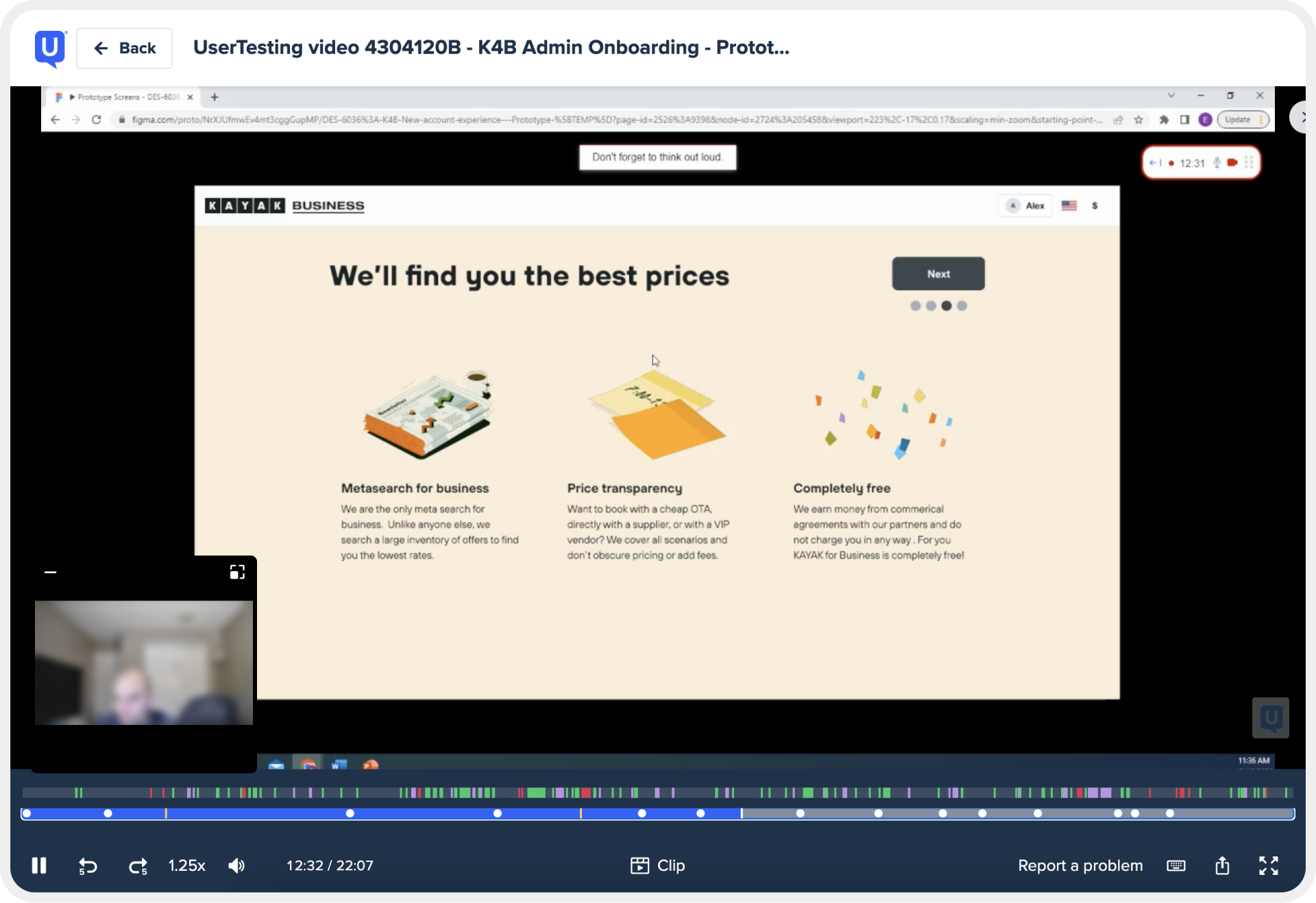
Putting the New IA to the Test
I tested a realistic Figma prototype reflecting the updated settings structure. The goal was to see if added visual context improved navigation and findability, especially between personal and admin settings, based on earlier user feedback.


The Impact
Clearer labels and smarter grouping helped users find what they needed - faster, with less friction.
3.5x increase in visits to underused pages
28% fewer support tickets in the first month post-launch
Key Takeaways
-
I learned that setting clear goals for user testing is crucial. By specifying exactly what I wanted to evaluate or validate, I was able to gather more focused and actionable feedback.
-
Running pilot tests reminded me that, as designers, we’re not the end-users. These initial tests helped me spot potential issues early and refine the research design to better suit real user needs.
-
This project reinforced the value of iterative testing. By incorporating feedback from each testing round, I could continuously refine the prototype, leading to a more intuitive and user-friendly final design.