


Design Library Creation
A reusable design library in Figma
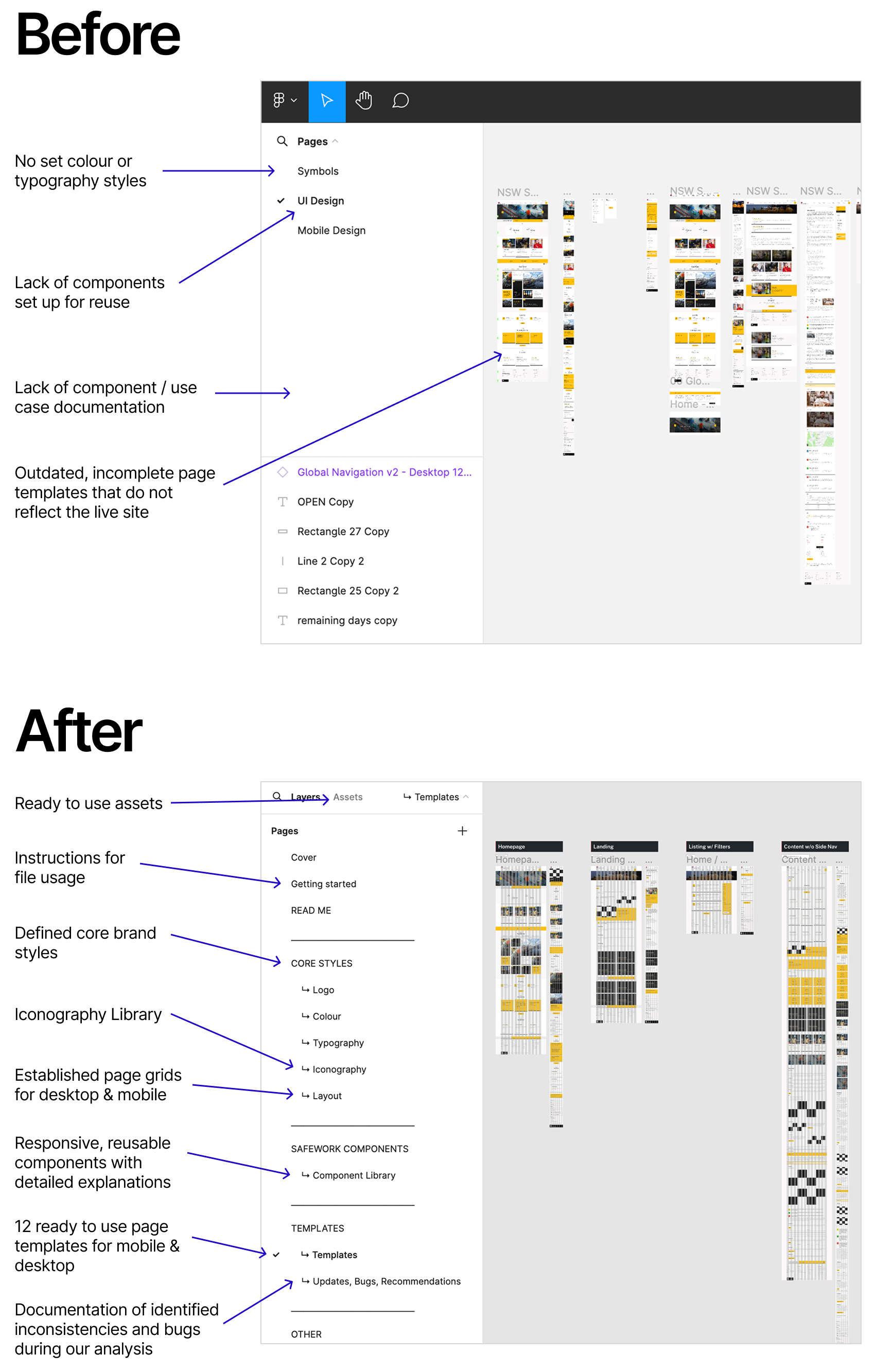
SafeWork NSW’s style guide was scattered across multiple design files, making it hard to navigate and leading to inconsistent, non-responsive components.
I created a reusable, well-organized Figma library to streamline workflows, improve consistency, and support a better user experience across their website.
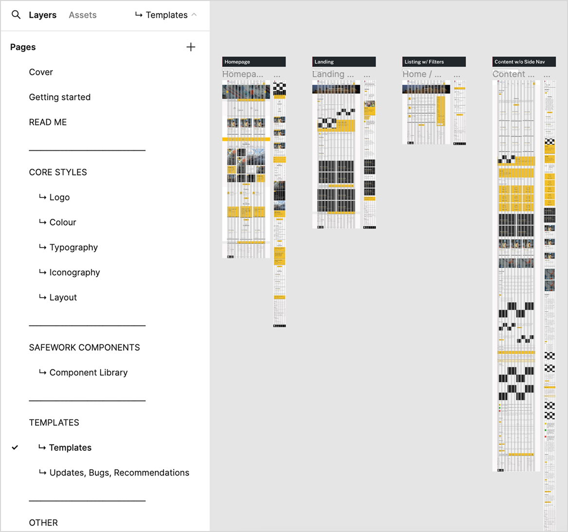
Role
UI / UX Designer
Time
2 months
MY OBJECTIVE
To create a unified, user-friendly design library in Figma that streamlines collaboration, ensures brand consistency, and provides effortless access to assets.
The Process
A full audit of website components and styles laid the groundwork for a structured, reusable design system in Figma. Defined styles ensured consistency, while an organized icon library and page-type reviews streamlined the design process, making collaboration smoother and more efficient.
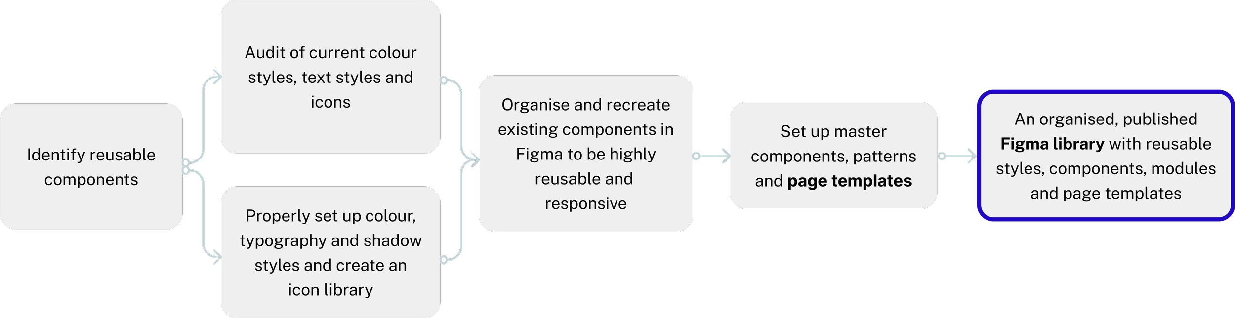
Audit of Current Site
The first step involved a thorough audit of the existing website to pinpoint which components could be reused and which ones need to be customized.
This included making a detailed list of all reusable elements, such as buttons, forms, and navigation bars, and identifying any unique, bespoke components that require special attention.

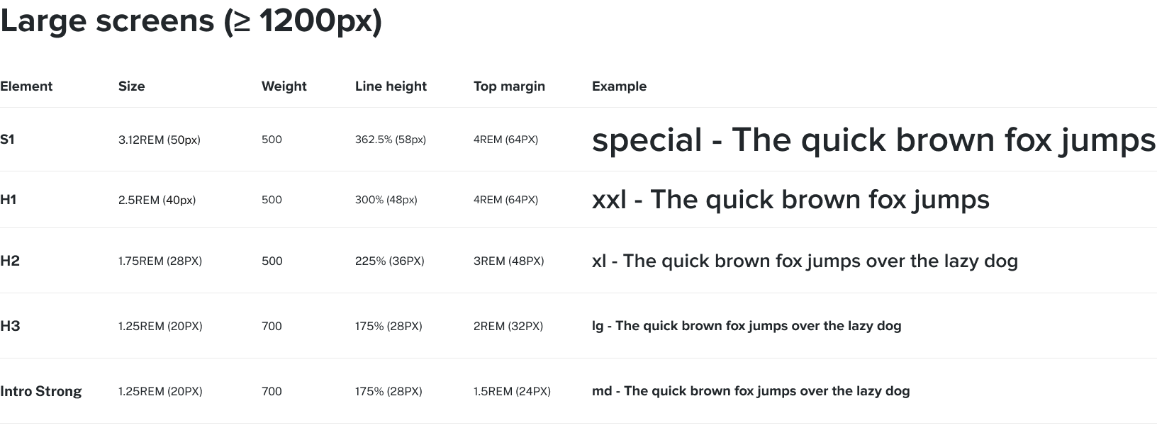
Set Up Styles & Libraries
The next step was setting up the color palette, typography, shadow styles, and icon library to ensure a cohesive look and feel across the project.
This foundational step was crucial for maintaining design consistency and facilitating easy updates in the future.
Recreate Components in Figma
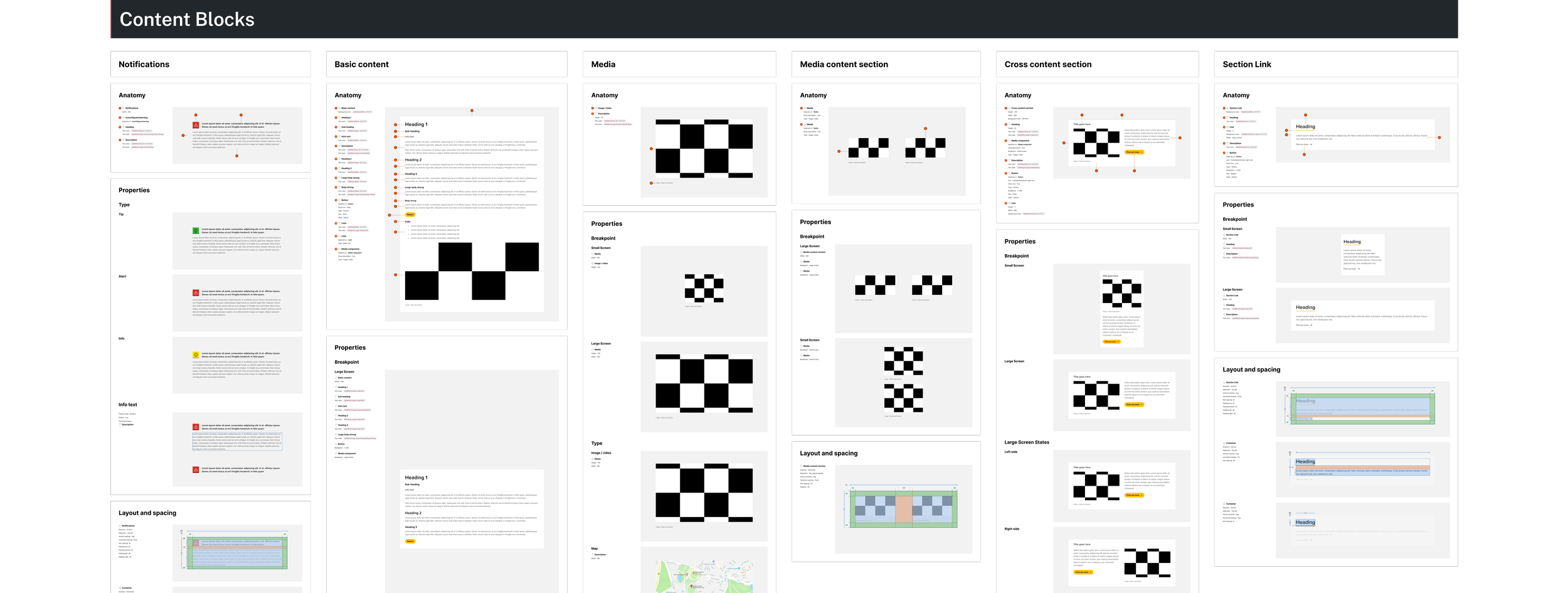
Existing components were restructured and rebuilt in Figma to be highly reusable and fully responsive.
Using the atomic design methodology, elements were broken down into their smallest building blocks (atoms) and systematically assembled into molecules, organisms, and templates. This approach made the design system flexible, scalable, and easy to maintain.
Set Up Master Components, Patterns, & Templates
This step involved establishing master components, design patterns, and page templates, that will later serve as the building blocks for all design elements, ensuring consistency and efficiency. The below shown page templates provide a solid foundation for creating new pages quickly.
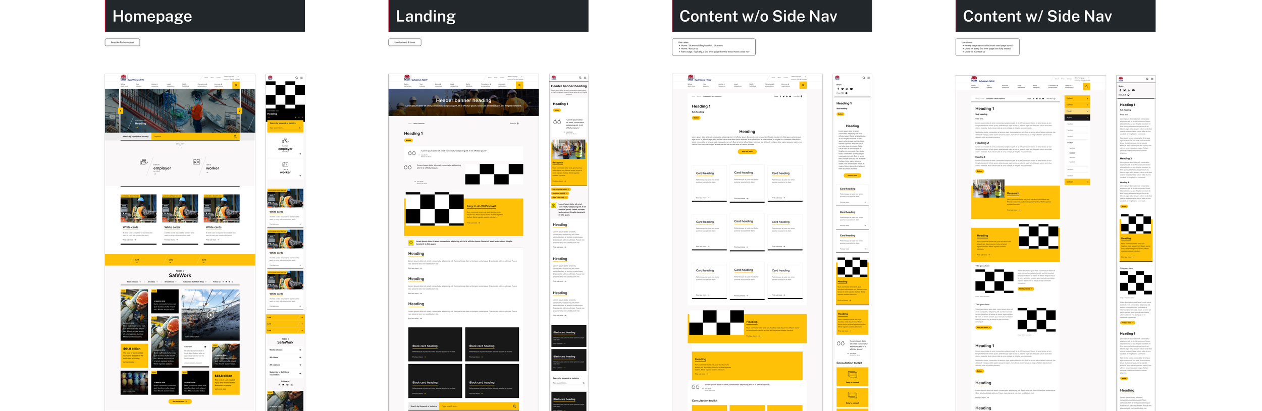
Deliver an Organized, Reusable Design Library
The final result was a well-organized, reusable design library with consistent styles, components, modules, and page templates - enabling the team to maintain a cohesive experience across all touchpoints and significantly improving workflow efficiency.
Key Takeaways
-
Through this project, I really strengthened my ability to design reusable and responsive components in Figma. I made sure that they adapt effortlessly to different devices and screen sizes while delivering a consistent and intuitive user experience.
-
Organizing and recreating components using the atomic design methodology has given me a powerful framework for building scalable and sustainable design systems, making it easier to maintain consistency and adapt as the project evolves.
-
This project taught me how a well-organized design library can cut down on repetitive work, make collaboration between teams smoother, and speed up the delivery of high-quality designs. By setting up reusable components, I saw how much more efficient the process becomes and how it helps everyone stay aligned - whether it's design or development.